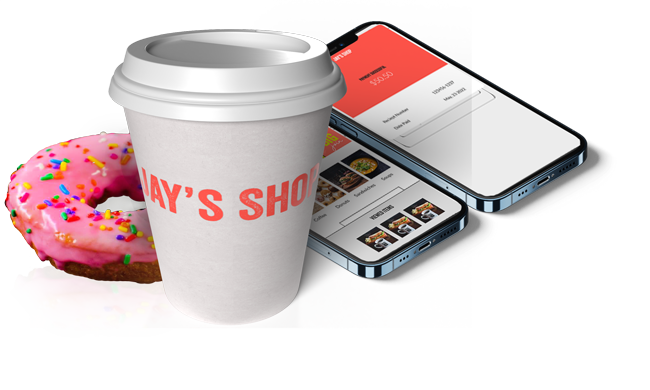
Jay's
A UX case study of designing the app home page for 7+ million users.
A UX case study of designing the app home page for 7+ million users.
We are adding the new "saved orders" feature to attract and retain customers in our online system. We have noticed competitors introducing features to streamline the ordering process. We want to create a product that competes in the market, and increases customer satisfaction.

Age: 43
Education: Binghamton University BA
Hometown: Newark Valley, NY
Family: Single
Occcupation: Web Developer
Quote
"I value convenience and I don't mind paying a little extra for it "
I am 43 years old. I work at a major public university in a remote position. Even though I work remote I still like to be around people. Working in a coffee shop allows me to feel connected and productive.
Goal
Someone who enjoys hanging out at coffee house and wants a place outside of their home and workplace where they can be connected and productive. This type of customer varies in age and occupation.
Frustration
Poor organization at the checkout counter and their inability to find adequate workspace. Waiting in line to place orders and pick up items interrupts their productivity and discourages them from placing an order.
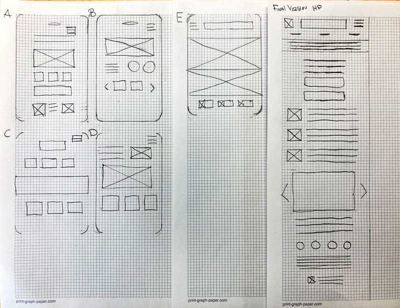
Once I was satisfied with the elements in the page wireframes I transition the design into digital wireframes in Figma.
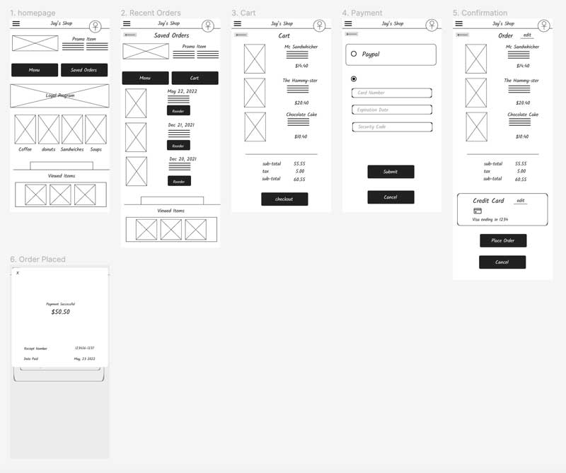
The Hi-fidelity app prototype for Jay’s that was tested.
Included an avatar icon to highlight the profile feature. We also included a confirmation page so users can review their order before it is submitted.
Hi-fi PrototypePeople like convenience of re-ordering, but also like to be able to customize their order.
Supporting evidence from the usability study.
2 out of 5 total participants said that they didn’t think the reorder feature would be useful since it was flexible enough.
"What if I want to reorder something but then substitute something in my order"
— Katie, sandwich consumer from Owego, New York
People want the "rewards" account feature to be more prominent.
Supporting evidence from the usability study.
3 out of 5 think that the rewards account feature should be more obvious.
"It seems like the account should be under an avatar icon"
— Lorn, coffee connoisseur from Cortland, New York
People want a confirmation page to confirm their order before it is submitted.
Supporting evidence from the usability study.
2 out of 5 total participants said they were confused when their order was just submitted without them confirming it.
"Did it submit already?! It seems like there should be a confirmation page, so I can confirm what I ordered."
— Mom, Sandwich consumer from Apalachin, NY
Users want a confirmation page to confirm their order before it is submitted.
Users like convenience of re-ordering, but also like to be able to customize their order.
People want the "rewards" account feature to be more prominent.